— PROJECT NAME
Information Architecture
— ROLE
Researcher & UX Designer
— DATE
09/23
Baked by Melissa is a New York baking brand founded by Melissa Benishay in 2008. Melissa was not passionate about her job, so much so that in 2008 she was fired and at that time, together with her brother, they decided to start marketing the famous cupcakes that she had been cooking for her family and friends.
Today it has 14 stores and ships throughout the United States.
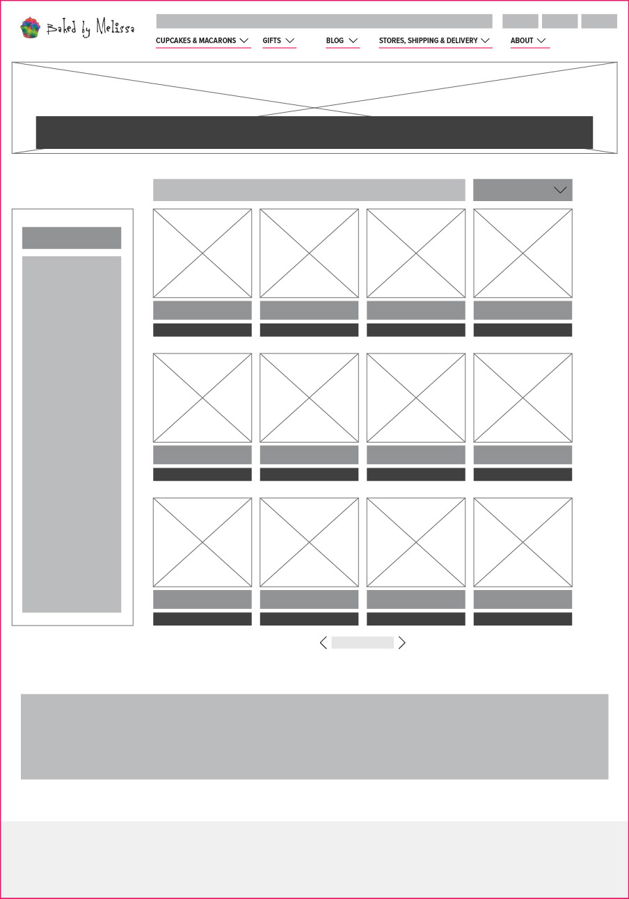
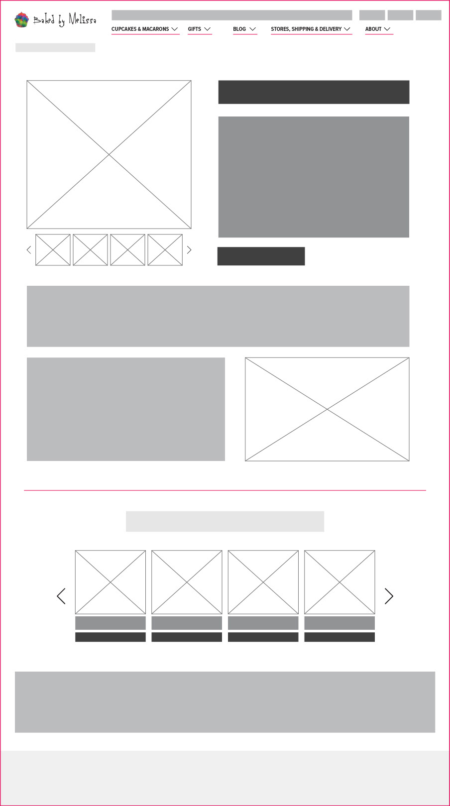
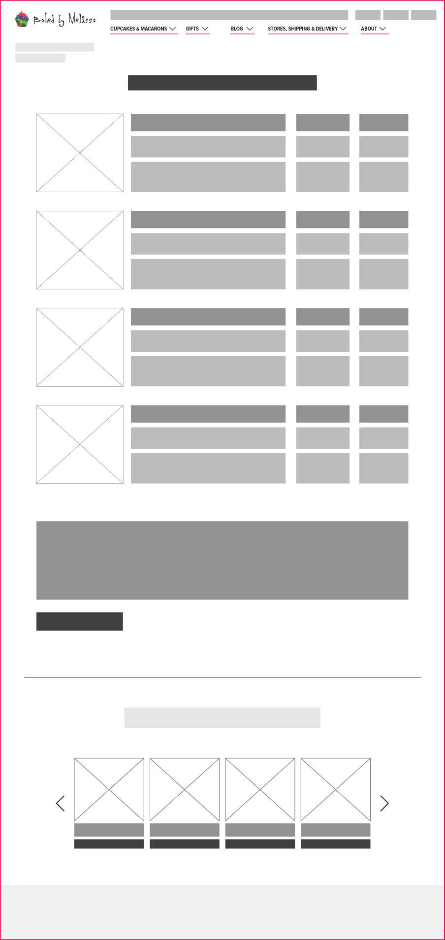
Site Mapping

Wireframing
Blog Suggestions
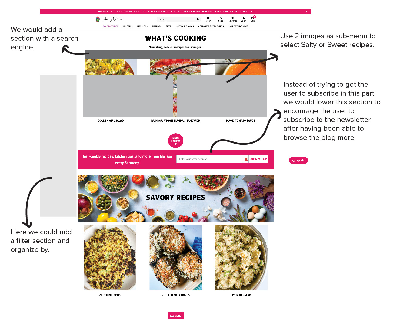
Changes in Blog:
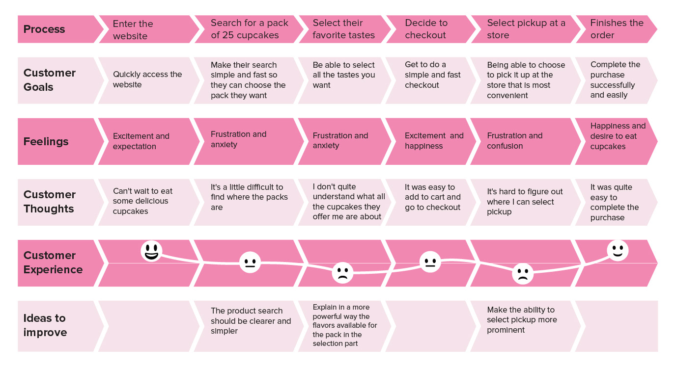
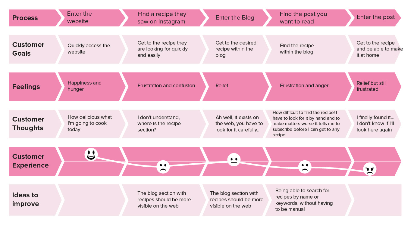
As I detailed in the journey map of the user who searches the blog to be able to obtain recipes that he saw on Melissa’s social networks, or simply knows that Melissa has good recipes on her website, we see that there are errors and problems on it.
The user ends up managing to reach the objective but after a good while of searching and scrolling, for this reason, later in the process of improving the website, we recommend separating the recipes between Salty and Sweet, add filters and a search section to make it faster and more efficient to find the recipe you want.
Problem Statement
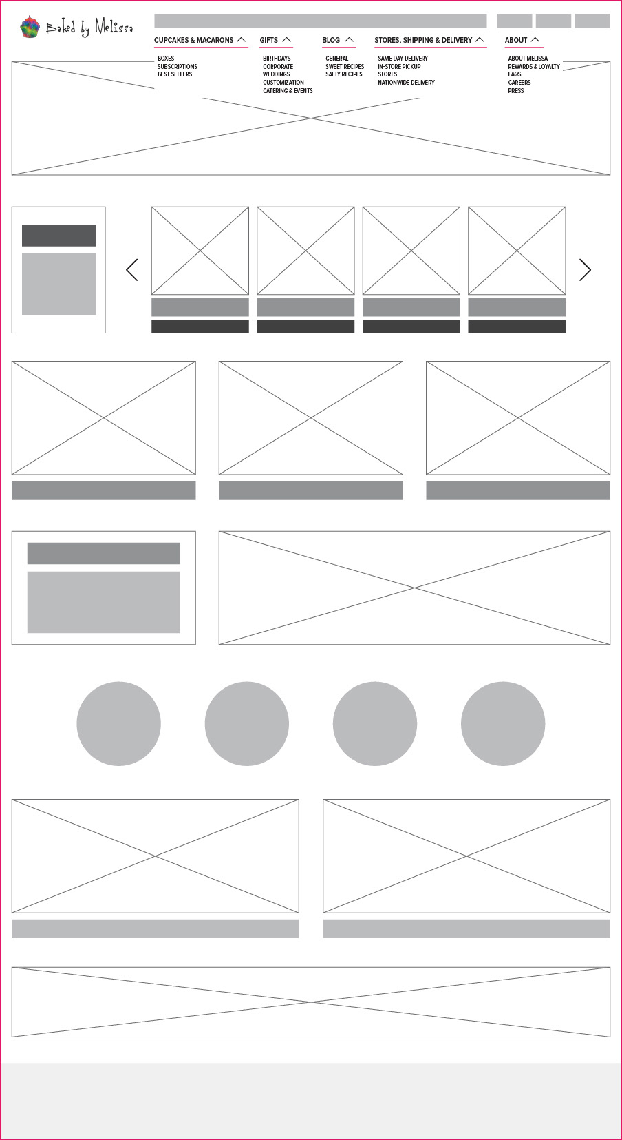
The main page of Baked by Melissa has a total of 9 horizontal modules in which, as can be seen when we look at the entire page, there are no clear hierarchies between each module, there is no specific organization of the communicated elements and the navigation can be improved by making it more understandable and more concise.
In summary, we observe that it is an overwhelming page, with a lot of information, without whitespaces and a little difficult to navigate and get to what one wants or needs from it.
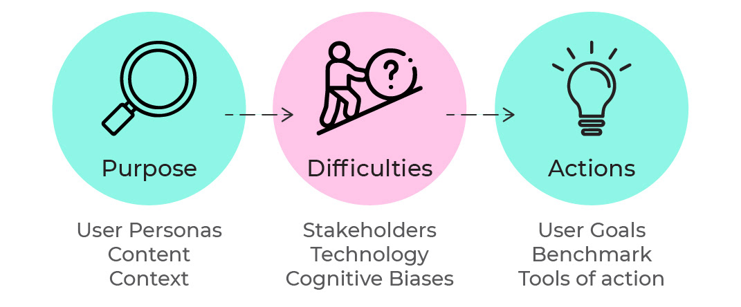
Process
Go through these 9 factors within; Purpose, Difficulties and Actions.
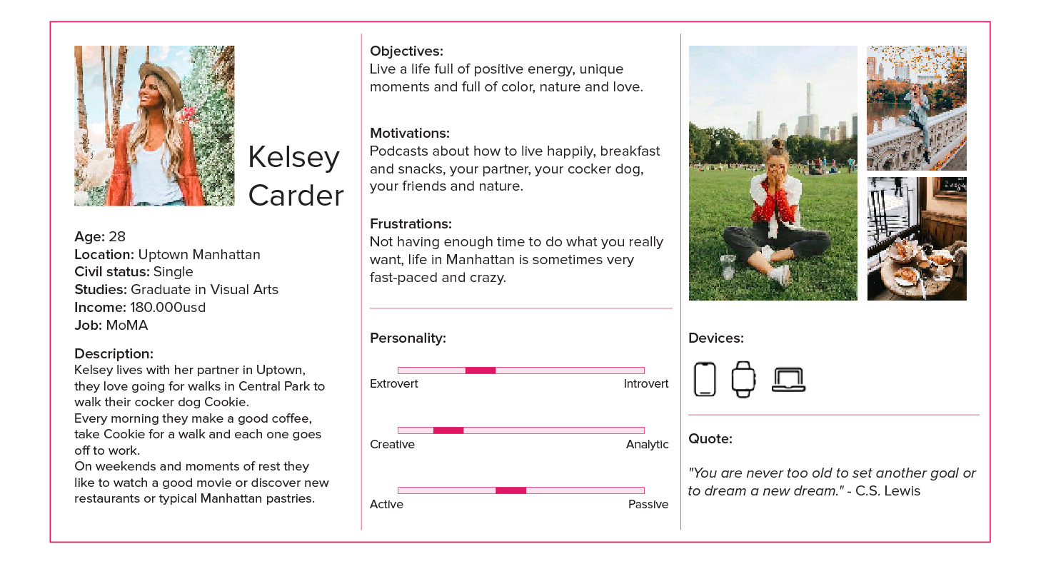
User Persona 1
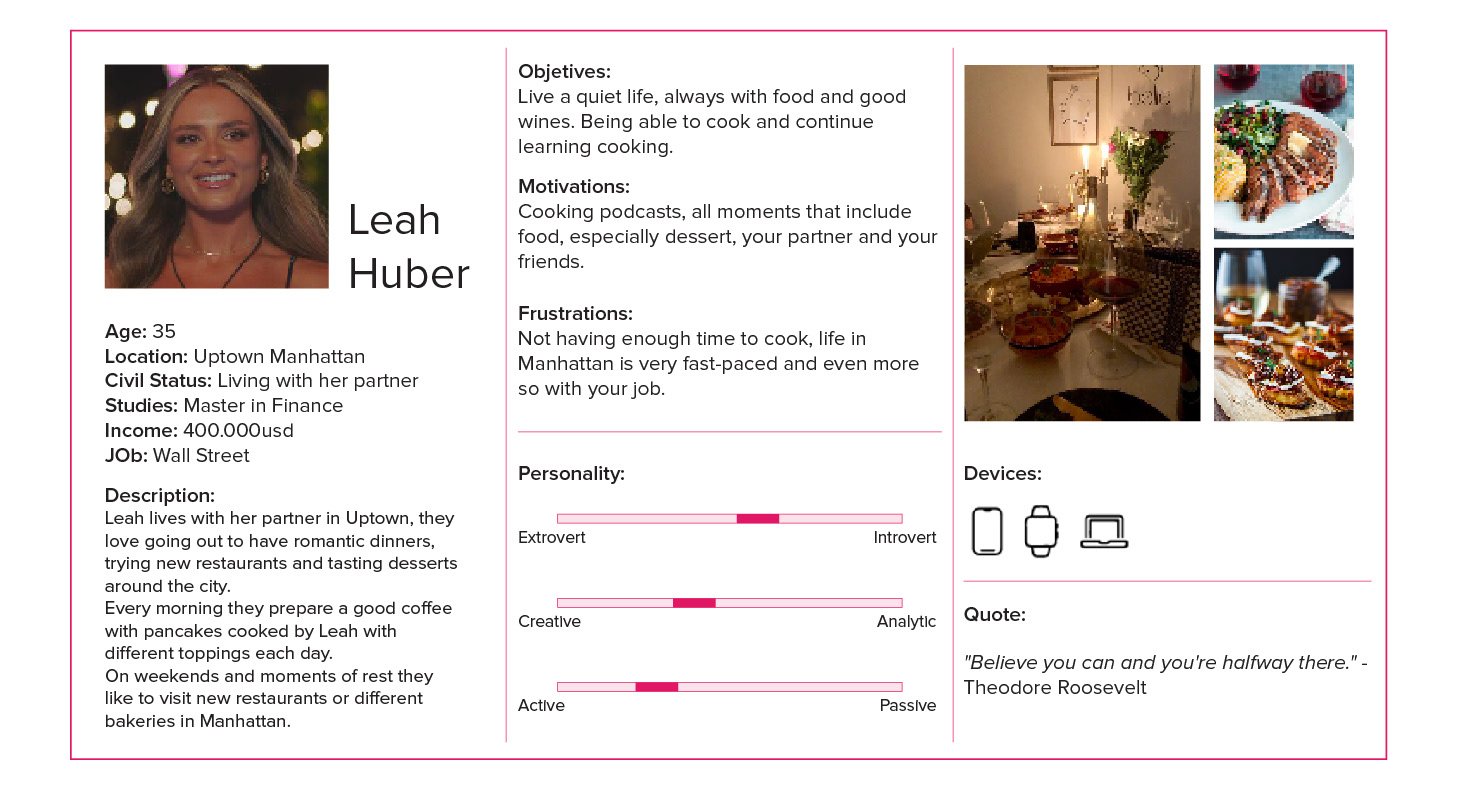
User Persona 2
Content
What communication are we looking to convey?
What we seek to convey is that the page be more sober in terms of margins, colors and amount of information.
That the target audience achieves; find the product in a simple and quick way, having easy access to the information of each product and element offered on the page. As well as showing that products have different textures, flavors and mixtures of ingredients that make them unique.
How do we generate the proposition of Product value?
The value and differential of the product are:
- Creative Mini Cupcakes and Macarons
- Variety of Flavors and Decoration creative
- Fun Brand Experience
- Personalization and Gift Options
- Presence at Events and Collaborations Specials
- Focus on Celebrations and Occasions Specials
- Customer Service and Commitment Line
To generate and demonstrate the value of Baked by Melissa products, taking into account those detailed above, and capture it on the website in an organized and concise way, without overwhelming the user with so many repetitive visual elements, arriving at a website that maintains the creativity that exists in the products that are sold, but that at the same time achieves convey it simply.
How relevant is the information for the user?
The information is very relevant for the user, since the company reveals the flavors that each cupcake has, so those people who cannot eat some type of food end up knowing which cupcakes and macarons they can buy or not. As well as, having a better idea of what kind of flavors and textures you are choosing, without having to guess.
This gives the user greater security for purchasing and consumption.
At the same time, for recurring users and those who like cooking, it is important that the information is well organized and hierarchical so that they can get to what they need, without having to browse the web a lot. For example: to reach the blog, the loyalty program and learn more about Melissa, one must scroll to the end of the main page to obtain a banner that will take you to said information/page.
Web vs. Social Media
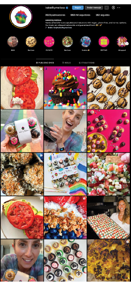
The website focuses on online orders almost 100%. But now, we will go a little deeper and see what Melissa does on Instagram and Tik Tok, which are one of her strongest networks and the strongest networks in the United States* for the type of audience she has.
As we can see on Instagram we see not only posts of what is sold on its website and in its stores, but also posts of savory and sweet recipes.
This makes us think that there is an audience that is more hooked on the side of different and delicious recipes because also, by seeing the interaction of the posts, those with recipes get exponentially more than those focused on their own products.
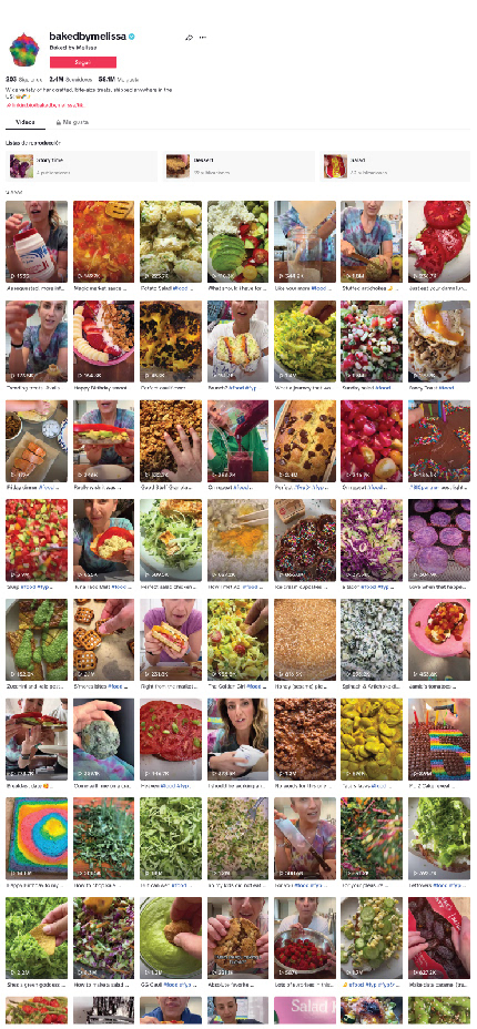
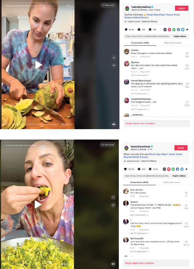
On the other hand, her TikTok focuses almost 100% on salty and sweet recipes, here again it is shown that there is an audience very interested in this type of content created by her, making it noticeable that the web is lacking this type of content.
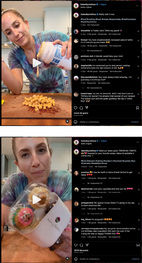
The content on social media ends up being very personal, she interacts with the user. This gives a feeling of closeness, that she is just another girl who loves to cook. There are videos that give the impression of being very “homemade”, “100%” her.
Therefore, summarizing and comparing social media with the web we can see that:
- The website lacks more “natural” elements
- They don’t give much importance to their blog recipes
- There are no videos of Melissa cooking
Context
Why does the user link to the content?
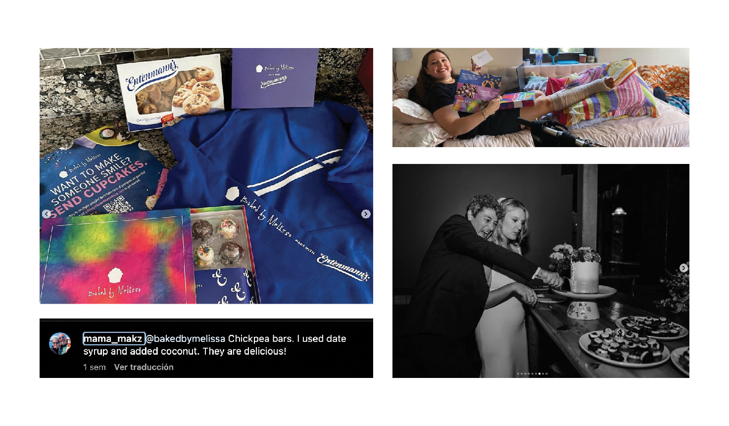
The user is linked to the content because it is a different product, one could say that the products are almost unique. That is why they generate interesting content for the user. We see that the company sells mini-cupcakes, with textures, flavors and colors different from the traditional ones.
In turn, users interact with Baked by Melissa’s social networks, especially when she provides organic cooking videos, giving the recipes in a simple way and showing her exactly what she is.
On the other hand, we can also see that users link to Melissa’s content because of her merchandise, demonstrating recipes that she has shared made by themselves, sharing beautiful moments with the products that she sells on the web and in her stores and how You can give them a nice gift to someone you love.
How does the user connect with the content?
The user is linked through the website, physical premises, social networks, blog, merchandise, (stickers, t-shirts, etc.).
What is the bridge that connects them?
The bridge that connects users with the brand are several, all of them were mentioned above, but we believe that the strongest of all is the bridge that Melissa creates on her social networks, how she interacts in them gives a feeling of closeness to her and its world full of colors, love, joy, flavors and textures.
Technology
Data Analysis
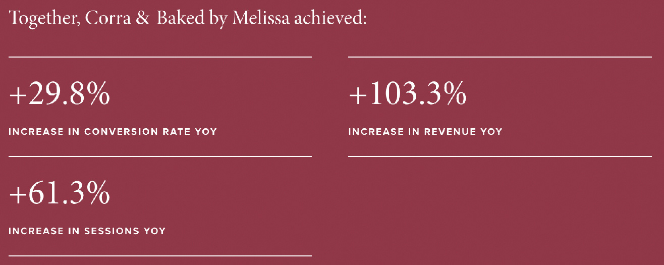
We do not have information on this point, but we found an analysis carried out by a company (Corra*) that made changes to the website but we do not have a clear date of when these studies and these changes were made.
In any case, we can capture them so that they can give us a snapshot of how the changes they made had an impact on the web.
In any case, we must keep in mind that we do not see these changes 100% reflected on the current website.
The work they did was based on wanting to offer a simple and fast experience for the user, even if it had complex logistics for the company, taking into account these points:
The perishable nature of products requiring custom shipping rules.
The ability to choose exactly what flavors you would like in your package and order them up to 365 days in advance.
The need for advanced omnichannel capabilities.
They managed to create a design that reflects the personality of Baked by Melissa, using Magento 2 Commerce (e-commerce platform developed in PHP – Now called Adobe Commerce). At the same time, they implemented Upsell opportunities throughout the customer journey, maintaining the user’s natural flow.
They added animations and videos to the website to give the user moments to see the products being created by Melissa and they also added unboxing.
Website loading seconds decreased to 2.5 seconds.
They incorporated the ability to buy and send products throughout the country, to be able to pick up or receive your order at your home through a courier service. For this, certain elements necessary for it to become a reality were ensured.
And finally, they added the rewards section to the page using Yotpo (a marketing platform that focuses on helping businesses generate and display reviews and customer-generated content)
Points of Contact
Baked by Melissa has different points of contact with its brand, we detail them below:
- Web page
- Social Networks (Facebook, Instagram, TikTok & Twitter)
- Mailings
- Videos
- Physical products
- Merchandising
- Blog
- Customer Support
- Local
- Packaging
- Coupons and promotions in store and at Web
- Loyalty/Rewards program (points for customers on your website)
- Shipping
- Delivery
- Pickup
- Quality of your products
- Photography
Artificial Intelligence
Regarding artificial intelligence, we do not have any information regarding whether they use artificial intelligence both on the web and in their social networks or other communications.
Cognitive Biases
Anticipation:
To create a new information architecture that we have on the current website, with the changes that we have been detailing in the project, we will always take into account what already exists on the website today.
We cannot change the main aesthetic of it, which makes it known to the user, we cannot make drastic changes to where some of the elements are as this would cause the user to get lost and complicate navigation.
We must maintain patterns as proposed by Gestalt theory, maintaining similarities, continuity, symmetry. We cannot go beyond what is already known by the user since they have pre-defined assumptions before interacting with the website.
The user’s cognitive load must be lowered, their attention to be able to interact with the site is high, therefore we will lower that load by lowering the amount of information that the user can process, so that it is not overwhelming.
Finally, we will also maintain some of the patterns already recognized by the user who uses the site for the different actions that can be performed on it. In this way, the changes made will be more easy for absorbing information. And, in turn, it will be easier for you to guess what may happen next.
Proposed Value:
Why?
The motivation for making these changes is to be able to effectively and efficiently communicate all the information that the user is looking for. The site today, as we have mentioned, is overwhelming, without white spaces, with a lot of information, without clear hierarchy and organization.
We want the user to be able to find what they are looking for without it being a headache, without having to go through the entire website or have many clicks to reach what they want.
How?
We are going to bring down to earth all the elements and all the information on the page, in this case we will focus on the home page, we will purify it and we will organize and prioritize it again based on everything analyzed in this project. We will reorganize the menu, giving a little more information to the user so that they know which sections of it have a dropdown, which do not. At the same time, we will provide more white space and clean up the accumulation of information on the entire main page of the site.
What?
The result we want to obtain with this is a more fluid navigation around the entire page, but attacking first the main face of the website, where the majority of users will have their first interaction. In order to identify whether the changes made are successful or not, we would recommend first carrying out some UserTestings before launching the final design, and when launching it perhaps perform an A/B test to compare Conversion Rate, Time on page, How much abandonment there is along the way , etc. I would continue analyzing this later with Google Analytics or the platform used in Baked by Melissa after the change was implemented to compare with the last 6 months before the change and the next 6 months after the change was made.
Time:
We believe that by making these changes we will further minimize the time it takes the user to understand and perform the actions they want within the website.
User Goals
Primary users go to the website to look for mini cupcakes to buy for themselves, or to send to someone they love for a special reason.
On the other hand, there are also users who enter the website looking for recipes, as they saw on the Baked by Melissa networks, they find them in its blog section.
What should be displayed on the website to satisfy the needs of its main users are the following:
Quick, simple and secure purchase of cupcakes and macarons
Easy entry to the blog to be able discover new recipes and flavors
Nowadays we believe that the website does not satisfy these two points 100% since we see it very loaded, with little breathing space, a lot of information and it is not very easy to navigate, making, for example, your blog more difficult to find.
We propose, based on everything seen above, a website that includes the two types of users that we detail.
All sales sections are important, with the necessary information on products, shipping, etc., as well as the Blog. You can get more juice out of it and attract more of the audience you end up targeting on your social networks, who would be interested in obtaining and reading your articles and, probably, buying their first recipe book. This would further grow the movement of this sector of the web to which not much attention is paid today.
At the same time, we believe that everything on the website can be purified, summarized, ordered and prioritized in a simpler and more usable way so that whoever visits the website understands what it is about and what it offers. Fewer items on the menu, showing which menu items are drop-down menus, etc. Adding more white space, less information saturation in banners and photography.
Benchmark
To start with the Benchmark, we look for direct and indirect competencies of Baked by Melissa.
Direct Competencies:
- Crumbs Bake Shop.
- Magnolia Bakery.
- Georgetown Cupcake.
- Sprinkles Cupcakes.
Indirect Competencies:
- Local Bakeries.
- Supermarkets and Grocery Stores.
- Other Dessert Options.
- Healthy Eating Trends.
User Flow & User Journey 1
User Flow & User Journey 2
Project done at Universidad ORT Uruguay | User Experience Design Post Graduate Diploma | Information Architecture